Thank you for reading. Nice to meet you—I’m “Lulu,” and I joined the company in April 2026! In this post, I’d like to share what led me to join the Dandelions and my thoughts since joining.
The reason I joined the company
I majored in microbiology in college and was interested in medicine and the mechanisms of disease. However, when I realized that working as a researcher in Japan required a high level of Japanese proficiency, I began studying the basics of IT while continuing to learn Japanese. After that, I moved from Chiba Prefecture to Nagoya and began looking for a job in the IT industry.
When I first learned about Dandelions, Inc., I was drawn to its corporate philosophy of valuing employee growth and its warm, welcoming atmosphere where Japanese and international employees work together.
Since joining the company, I’ve found it deeply rewarding to be able to grow and learn in an environment where I can take on the challenges of IT and web development—which had always been my goal.
Impressions After Joining the Company
I’m still getting used to the job, but through training, I’m deepening my understanding of IT fundamentals while also enjoying learning new technologies such as Java and SQL.
I’m still learning Japanese, but thanks to the kind support of my boss and senior colleagues, I’ve gradually come to understand not only the technical aspects but also the company culture and how work is done here.
Before joining the company, I thought Japanese companies would have a much stricter work environment, but in reality, it’s a warm and supportive place, and I find it very easy to work here.
Self‑Introduction
Outside of work, I enjoy watching horror movies, eating good food, and visiting new places. When I lived in the U.S., I used to enjoy taking spontaneous drives with my dog.
Since coming to Japan, my wife and I have been visiting various places together and collecting magnets from our travels. So far, we’ve traveled to Thailand, South Korea, Taiwan, and Mexico, and we also explore different parts of Japan whenever we find the time.
Since moving to Japan in 2022, we have visited 28 prefectures. Our goal is to visit all 47 prefectures someday.
Cancun, MexicoWat Arun, ThailandFukui PrefectureZhongzheng District, TaiwanStanley Hotel, United States
I love taking photos when I travel.
Thank you for reading this far. That’s all for today. Stay tuned for our next employee spotlight!
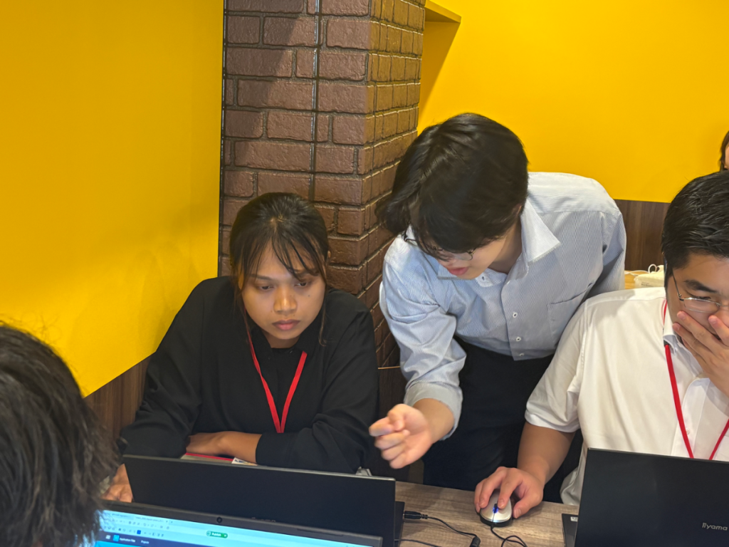
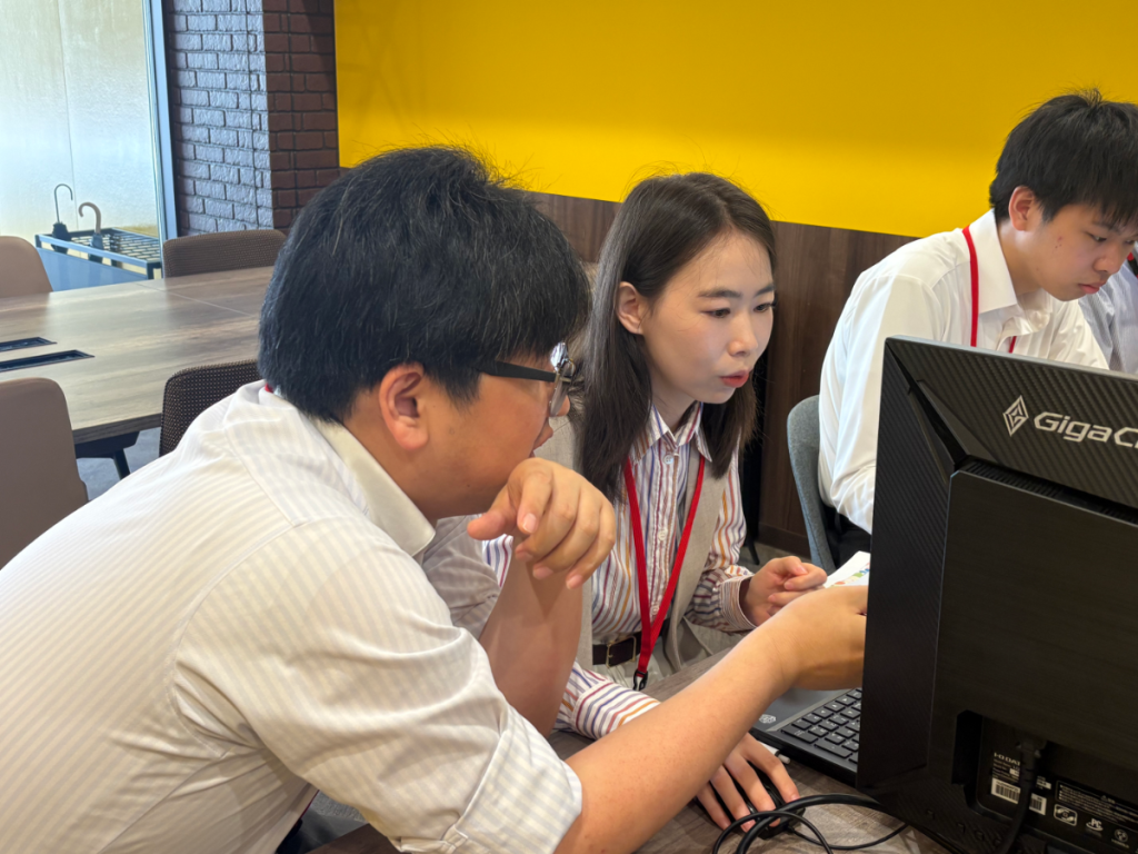
In August, we hosted an internship program at our company, with six participants. In Testimonial #1, we’d like to introduce our international students!
Myanmar International Students(Woman)
Before starting the internship, I had mixed feelings of anticipation and anxiety, but my nerves really kicked in during the self-introductions and company presentation on the first day. I felt particularly anxious when I learned that I would be working on creating LINE stickers. The process of creating characters using Adobe Firefly and selecting designs while considering the target audience turned out to be more interesting than I had imagined, and I realized that specific instructions are necessary to make effective use of AI.
During the Java programming exercises, I was worried about taking the tests. When I took the tests, I faced difficulties in identifying the causes of errors, but I was able to develop my ability to think independently while researching solutions online. Additionally, during the low-code development exercises using OutSystems, I learned the importance of understanding design documents and designing screens from the user’s perspective. I realized that it’s not just about making the system work—it’s also crucial that users feel confident using it when testing the system.
On the final day, I had the opportunity to present the results of the five-day program in my own words, and although I was nervous, I was very satisfied that I was able to get my message across. I received a variety of feedback from the employees, making it a valuable opportunity. Through this experience, I strongly felt that a career in IT requires not only technical skills but also communication skills, the ability to see things from others’ perspectives, and the ability to convey information clearly. I hope to apply what I’ve learned to my future studies at university, as well as to my job search and interviews, and continue to grow.
I would like to express my heartfelt gratitude to the employees and colleagues who have supported me over the past five days. With a positive and determined spirit, I will move forward to take on the challenges that lie ahead. Thank you all so much.
Chinese International Students(Woman)
Before starting the internship, I was nervous, feeling a mix of anticipation and a little anxiety. At the same time, I was looking forward to growing as a person while being supported by the warm and welcoming atmosphere created by the staff. Once the internship actually began, I often had to go through a process of trial and error because my knowledge of Java and OutSystems wasn’t sufficient. At first, I would sometimes panic when errors occurred, but by communicating with my teammates as we worked together, I gradually began to enjoy the work. I was also happy that I was able to liven up the conversations with my group members during group work. Furthermore, conducting a self-analysis as part of my self-introduction provided a valuable opportunity to take a fresh look at myself.
What I found particularly challenging during this internship was system development. Since I rarely had the opportunity to work with web systems on a daily basis, it took me a long time to identify the causes of errors. However, through this experience, I truly realized the importance of having a solid foundation of basic knowledge. Moving forward, I want to apply what I’ve learned and strive to solve problems more efficiently. Through this internship, I was able to improve my communication skills and my ability to build relationships with others. I also gained a deeper understanding of the IT industry and learned the importance of taking on new challenges. In particular, it was a major lesson for me to realize that taking on challenges without fear of not understanding something or of failure leads to my own personal growth.
I hope to use this experience as a stepping stone for my future growth, and I intend to continue taking on new challenges with enthusiasm, without fear of failure. Finally, I would like to express my heartfelt gratitude to everyone who gave me this valuable opportunity. Thanks to your warm support, I am now able to approach things with a brighter and more positive attitude than before. Thank you very much.
In this engineer blog, I introduce the topics I study and work on in my daily learning.
This time, I’ve selected two items that particularly caught my attention from the fixes included in version 2.23.1 of OutSystems Data Grid, provided on OutSystems Forge.
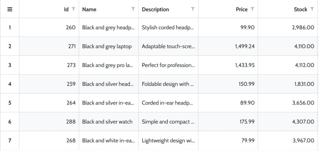
OutSystems Data Grid is a component available on OutSystems Forge. It allows you to display and edit data in a tabular format, offering features like sorting, filtering, and cell editing similar to Excel. With it, you can build list screens that are more advanced than a standard Table.
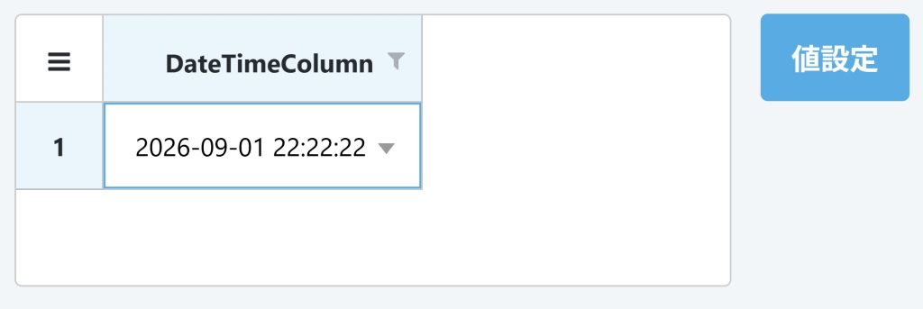
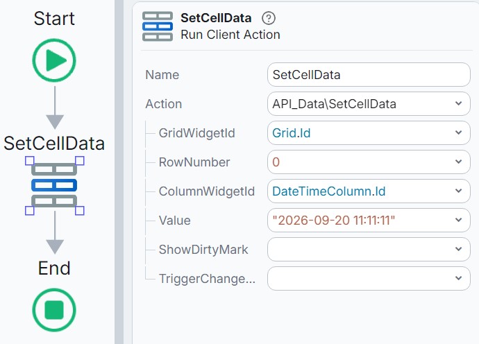
An issue where the ‘seconds’ value set in a DateTimeColumn was lost The problem where the seconds portion of a time value disappeared when using SetCellData on a DateTimeColumn has been fixed.
Steps to Reproduce the Issue Use SetCellData on a DateTimeColumn and set a time value. Example: 2026‑09‑20 11:11:11
Processing When the ‘Set Value’ Button Is Pressed
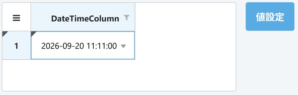
[ver 2.23.0 (previous version)] When setting the value ‘2026‑09‑20 11:11:11’, the seconds part is changed to ‘00’, resulting in it being stored as ‘2026‑09‑20 11:11:00’.
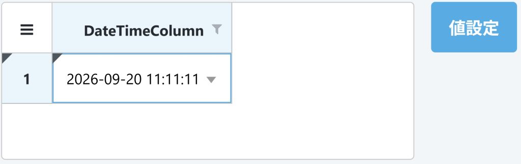
[ver 2.23.1 (new version)] The value ‘2026‑09‑20 11:11:11’ is now set correctly.
With this fix, even when using SetCellData to set a date‑time value, the seconds component is now preserved correctly.
Fix Item ②
Issue where a value could not be correctly identified when a DropdownColumn contained duplicate keys and display names A problem has been fixed in which, when using SetCellData on a DropdownColumn, the system could fail to correctly determine which option was being referenced if the same string existed in both the option’s Key (value) and Text (display name).
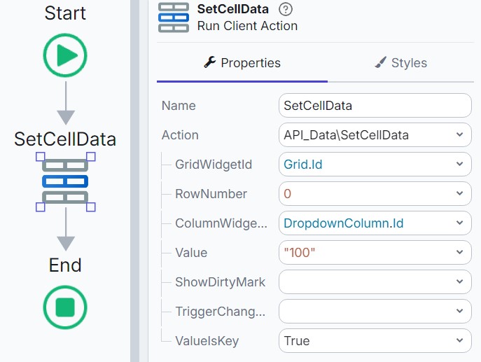
To address this issue, version 2.23.1 introduces a new input parameter, ValueIsKey, for SetCellData. By configuring ValueIsKey, you can explicitly specify how the provided value should be interpreted when determining which option it refers to.
True: The specified value is interpreted as the option’s Key.
False: The specified value is searched against both the Key and the Text, and the matching option is determined accordingly.
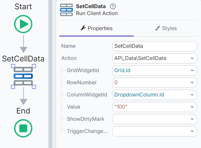
Steps to Reproduce the Issue Use SetCellData on a DropdownColumn and set a value. Example: 100
Processing When the ‘Set Value’ Button Is Pressed
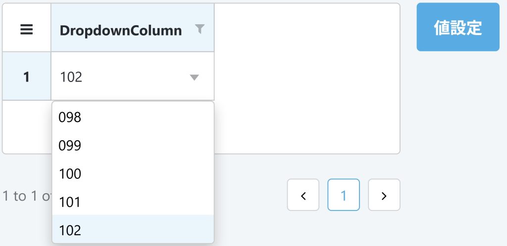
The available options in the DropdownColumn are as follows.
Value (Key)
Display Name (Text)
100
098
200
099
300
100
400
101
500
102
In this case, because the value ‘100’ matches both the Key and the Text, the system cannot correctly determine which option is being specified.
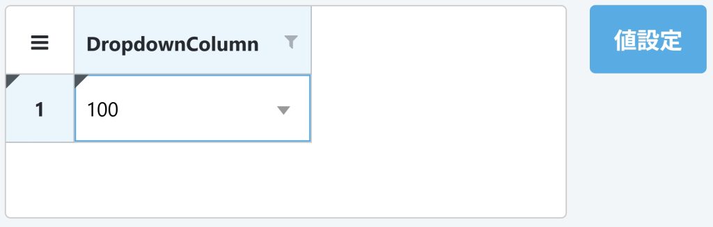
[ver 2.23.0 (previous version)] When setting the value ‘100’, the expected behavior is that the display name ‘098’, which corresponds to the value ‘100’, should be shown. However, ‘100’ is displayed instead.
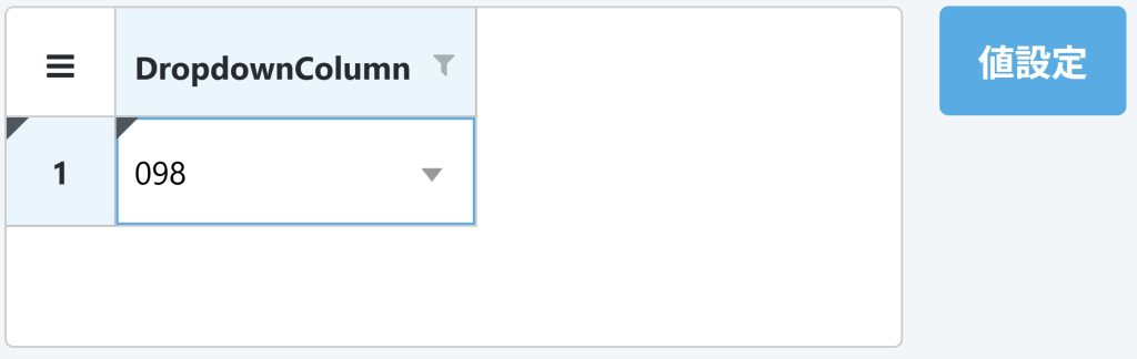
[ver 2.23.1 (new version)] The display name ‘098’, which corresponds to the value ‘100’, is now shown correctly.
Set ValueIsKey to True to interpret the value as a Key.
In this way, when you want to set a value by specifying the Key, setting ValueIsKey to True allows you to explicitly indicate the intended option.
Conclusion
In this article, I introduced the following two items that were fixed in OutSystems Data Grid version 2.23.1.
Fix for the issue where the ‘seconds’ component set in a DateTimeColumn was lost
Fix for the issue where a value could not be correctly resolved when the Key and Text overlapped in a DropdownColumn, along with the addition of ValueIsKey.
OutSystems Data Grid is continuously updated with new features and bug fixes. To use it safely and reliably, it is important to review the latest release notes and upgrade to the appropriate version. Make it a habit to check for updates regularly and plan your upgrades accordingly.
That’s all for this time. Please look forward to the next developer blog!
Thank you for reading. I’m “Gifukko,” and I’ve just joined the company. In this post, I’d like to talk about what led me to join the Dandelions and my impressions since joining.
The reason I joined the company
During my college years, I was a student in the College of Agriculture and was in an environment that had little to do with the IT industry. I conducted research on microorganisms at university, and thinking I could apply my knowledge of agriculture, I took a job at a food processing plant after graduation. I worked at my previous job for about two years. The work centered on assembly line tasks and required me to perform set procedures with precision. During that time, I had the opportunity to work with embedded systems—commonly known as microcomputers—and watching my senior colleagues handle them sparked my interest in technology. That encounter prompted me to start studying IT. However, when the senior colleague I had looked up to resigned, I began to think deeply about my own future. I decided I wanted to be in an environment where I could grow while learning new technologies, so I resolved to make a career change to the IT industry. The reason I applied to Dandelions was that I was drawn to the positive atmosphere I sensed during the interview. I was attracted to an environment where each person could work naturally, rather than one with a rigid corporate culture.
Impressions After Joining the Company
My previous job focused mainly on assembly line work, so it involved consistently performing set tasks. In contrast, my current job gives me the opportunity to learn something new every day. Sometimes I struggle to solve problems and feel embarrassed. Even so, I can really feel my knowledge growing little by little, and I’m happy to see myself improving. Since we’re an IT company, technical skills are obviously required, but because I also have opportunities to work at client sites, I feel that communication skills are important as well. We have training sessions for handling phone calls and face-to-face interactions. I was a bit nervous about it at first, but through daily practice, I feel I’m gradually improving. There are also foreign nationals working at our company. Everyone speaks Japanese very well, and when I think about how much effort they must have put in to become fluent in a foreign language, I truly admire them. The overall atmosphere at the company is great, and I feel it’s an environment where I can learn freely and comfortably.
Self‑Introduction
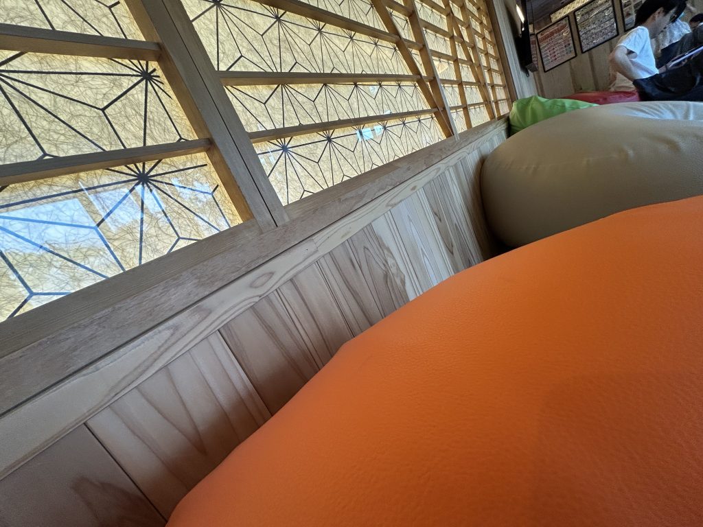
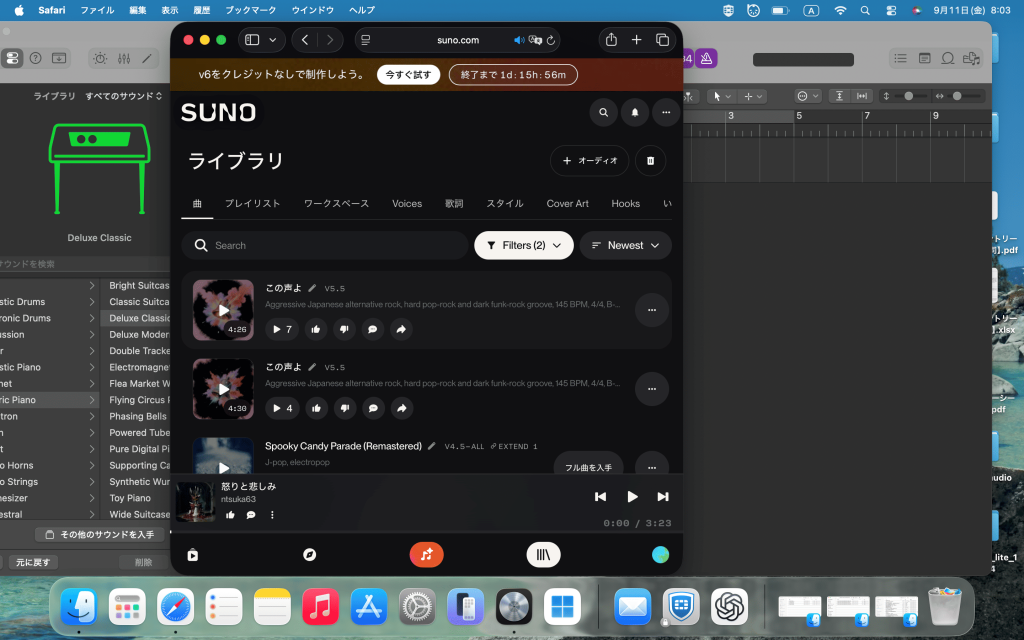
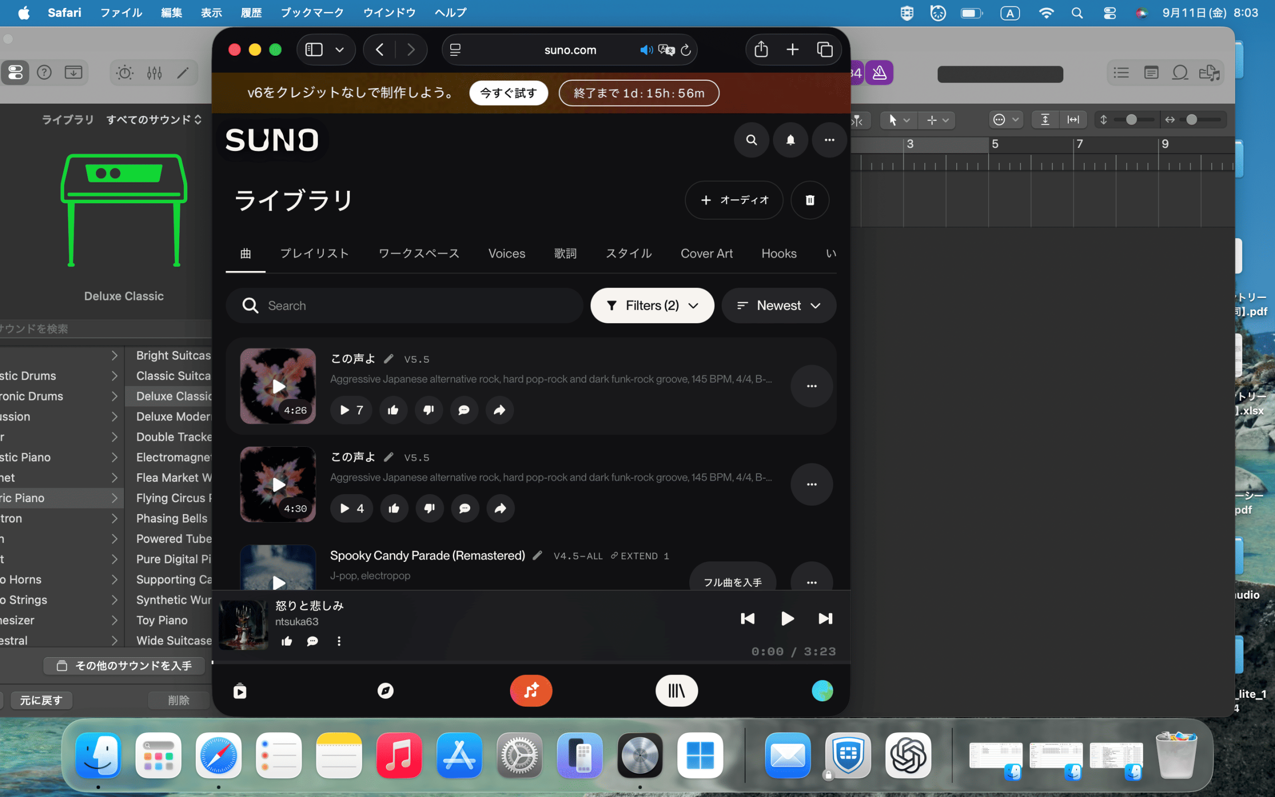
My hobby is visiting hot springs. I’ve been to every super sentō in Nagoya. I really love taking my time soaking in lukewarm water, letting my body float, and just relaxing. The moment after a long soak when I drink an ice-cold, sweet juice is the best. Music production is also one of my hobbies. Lately, I’ve noticed that the wave of AI adoption is spreading throughout the music industry as well. If I try to create everything with AI, the result won’t be the song I envision. However, by utilizing AI for tasks like analyzing vocals and instrument types or adding accompaniment, I can shorten the production time. I think that in the future, music production will become a hobby that more people can easily enjoy.
I’m sleeping at Yuno-ya, a natural hot spring called Tokichi-ro.I’m using SUNO, an AI music generator.
Thank you for reading this far. That’s all for this post. Stay tuned for the next blog post!
Hello, everyone. This is “Pudding🍮” from the Business Development Department. In this post, I’d like to tell you about the major redesign of “DandelionsJapan,” the overseas e-commerce site operated by our company. DandelionsJapan underwent a major website redesign this past March! In this post, I’d like to share—from my perspective as someone involved in the project—why we decided to redesign the site, what aspects we focused on during the redesign, and what changes we’ve seen since the launch.
What exactly is a “cross-border e-commerce site”?
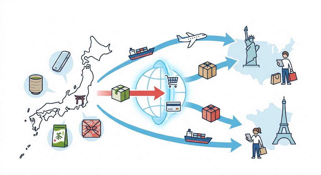
First of all, do you know what a “cross-border e-commerce site” is? Simply put, a cross-border e-commerce site is an online store that sells products to people overseas, across national borders. With the goal of bringing Japan’s attractive products to customers overseas, we have been selling a variety of Japanese products to customers in the United States, France, and other countries. I believe that one of the unique appeals of cross-border e-commerce is that it allows customers not only in Japan but also overseas to discover Japanese products and actually get their hands on them.
Why Did We Redesign DandelionsJapan?
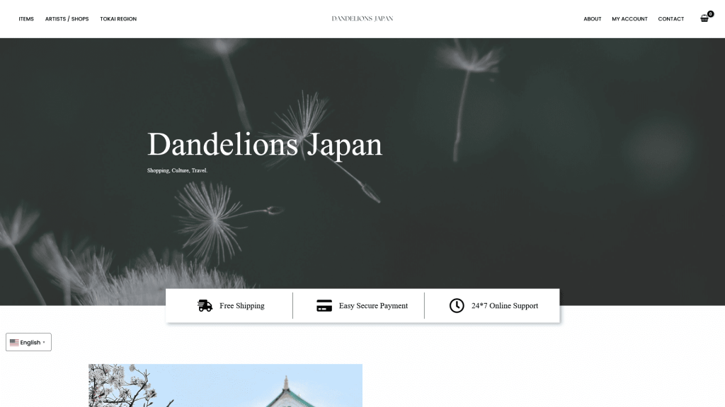
Originally, DandelionsJapan was planned and operated with a focus on “stylish designs that would appeal to international customers.” Our goal was not only to encourage international customers to purchase Japanese products—particularly those from the Tokai region and the Nagoya area—but also to spark their interest in Japan itself, inspiring them to think, “I’d like to actually visit Japan.” However, as we continued to operate the business, several challenges became apparent. One of the biggest issues was that it wasn’t clear who the site was intended for or what it was meant to convey. Because the site’s design didn’t quite match the price range of the products, and the range of product categories had expanded, it became unclear what exactly customers could buy at DandelionsJapan. If the target audience remains undefined, it becomes difficult to decide on the site’s design, create product photos and descriptions, or promote the site through ads and social media. “Who do we want to reach with this product?” “What impression do you want visitors to this site to have?” “What are the items you can only buy at DandelionsJapan?” We needed to take another look at these aspects. So, for this redesign, we decided not only to update the site’s appearance but also to reevaluate the site’s overall direction. We want more international customers to fall in love with Japan. We want them to learn more about Japanese culture. And we want them to experience more Japanese products. With these goals in mind, we’ve completely revamped DandelionsJapan.
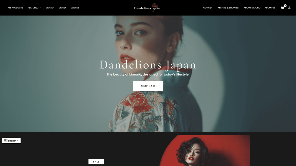
beforeafter
Specific Details of the Redesign
From here on, we’ll provide a detailed overview of exactly which parts of the site we’ve updated and how, specifically for our international customers.
◆Point A: “A Modern, Stylish Design”
The first major change we made was to the overall design of the site. With this redesign, we’ve defined our target audience more clearly.
We have defined our target audience as: ・People who are interested in Japan, love Japan, or love Japanese products ・Women in their 30s and 40s ・Targeted at the U.S. and Western markets
We have identified the following as the main products we want to sell: ・Kimonos ・Remade kimono items ・Fashion items that can be worn with kimonos ・Traditional Japanese crafts and so on.
On the previous site, the concept was a bit vague, making it difficult to achieve a consistent look across product types and designs. So this time, after clearly defining our target audience and the products we wanted to sell, we updated the design to emphasize “modern,” “elegant,” and “mature” aesthetics. When deciding on the design, we didn’t jump straight into production; instead, we first conducted market research. We searched for e-commerce sites that, like us, sell kimonos and other traditional Japanese products to international customers, and investigated questions such as: “What kinds of designs are being used?” “What kinds of products are being sold?” “What features are available?” While drawing inspiration from other sites, we didn’t simply copy them; instead, we created our design while carefully considering how to bring out the unique character of DandelionsJapan.
We’ve also made improvements to the product photos. Previously, we allowed up to four photos per product, but following the redesign, we’ve increased that limit to a maximum of eight photos per product. For international customers, product photos are extremely important on e-commerce sites where they cannot see the actual items in person. We’ve made sure to provide as much information as possible—not just front-view photos, but also details of the design, the texture of the fabric, the back of the item, and photos from different angles—so customers can get a comprehensive view. This allows customers to learn more about the products in detail before making a purchase.
◆Point B: “Convenient Feature Design”
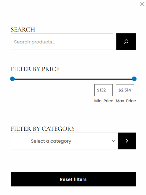
Next, we focused on features designed to ensure users can navigate the site comfortably. As part of this redesign, we added a “Back to Top” button, product filtering options, and a “Favorites” feature. One particular challenge was that, as the number of products increased, it became harder to find the specific product customers were looking for. No matter how appealing the products are, if it takes too long for users to find them, the site will be difficult to use. Therefore, we’ve revised our product categories and added filter functions to make it easier to find products. In addition to text-based searches (such as by product name), users can now narrow down their search results based on criteria such as store and price. “I want to find products made with kimono fabric.” “I’m looking for something in this price range.” We’ve made it possible for users to smoothly find the products they need based on their specific goals.
We’ve also added a feature that lets you save items you’re interested in to your favorites. On e-commerce sites, there are times when you might think, “I’m not ready to buy this right now, but I’d like to look at it again later.” By using the favorites feature, you can save items that catch your eye so you can compare them later or consider purchasing them.
We aimed to create a website where users can easily find products and discover items that catch their interest by minimizing any aspects that might make the site feel “difficult to use.”
◆Point C: “Enhancing a Sense of Security”
Another major improvement we’ve made is organizing information to help users feel confident about their purchases. When purchasing products from overseas e-commerce sites, some people may feel even more anxious than they do with domestic Japanese sites, wondering, “Is it really safe to buy from here?” In particular, when purchasing Japanese products from overseas, customers need not only product information but also details on the purchasing process, terms of service, frequently asked questions, and other relevant information. Therefore, as part of this redesign, we’ve organized information such as our USP (Unique Selling Proposition), FAQs, and terms of service, and we’ve upgraded the contact form to make it more user-friendly. We believe it’s important not just to display and sell products, but also to make customers feel that they can shop with confidence on this site.
What changes have there been since the redesign?
Since we underwent a major redesign, we’ve been seeing gradual changes on the site. Currently, the number of registered users and page views is gradually increasing. In addition, while we previously had many users from Asia, since the site redesign, we’ve seen an increase in visits from users in the United States—the market we’ve targeted this time. I think this may be a sign that the targets and direction we set for the site during this redesign are gradually starting to yield results. Of course, there are still plenty of areas that need improvement. In particular, the major challenge we face right now is how to bridge the gap between getting people to visit the site and actually purchasing products. Even if the number of visitors to the site increases, an e-commerce site cannot be considered successful unless customers actually make purchases. Therefore, moving forward, I feel it’s necessary not only to focus on website development but also to learn more about marketing, and to consider questions such as: “Why do customers buy this product?” “What kind of information leads to a purchase?” “What do international customers look for in Japanese products?” I feel it’s essential to give these aspects careful consideration.
Summary
This redesign marked a major turning point for DandelionsJapan. Not only did we update the site’s design, but by rethinking our core question—“Who are we trying to reach, and what do we want to convey?”—we’ve made the site’s direction much clearer than before. Moving forward, we plan to continue improving the site to make it more user-friendly and appealing, while taking user feedback and traffic data into account. Ultimately, we aim to make DandelionsJapan a platform that introduces international customers to the charm of Japanese culture and products, inspiring them to think, “I want to learn more about Japanese products” and “I want to visit Japan.”