As an engineer’s blog, I’d like to share what I’ve been learning on a daily basis.
I received an email asking me to migrate my assets to the new Deno platform, as the site where I had previously hosted my Discord bot had been rebuilt.
This migration allowed me to continue running the bot 24 hours a day for free, so I’d like to share more about that here.
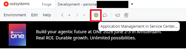
What is Deno Deploy?
Before getting into the main topic, let me first briefly explain Deno Deploy.
It is a serverless edge computing service provided by the Deno development team.
It is a cloud service that allows you to publish applications written in TypeScript or JavaScript to the Internet without having to worry about setting up or managing servers. Because it makes it easy to deploy web apps, APIs, bots, and more, it has been widely adopted by many developers.
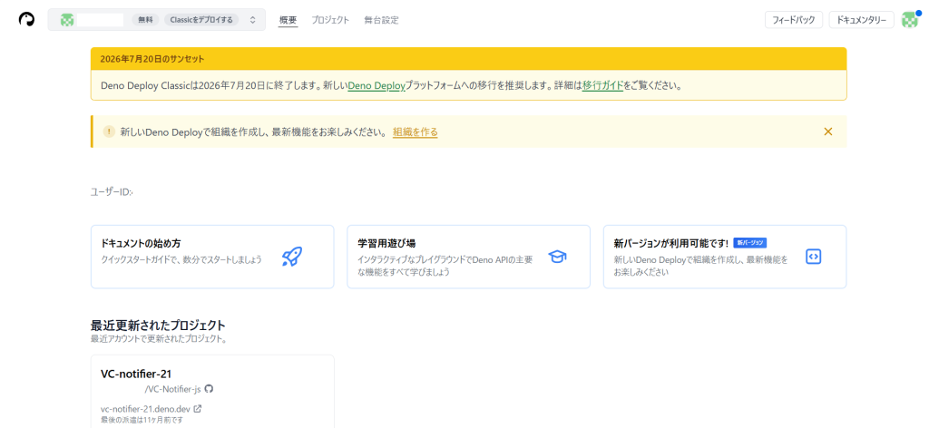
Email Content from Deno Deploy Classic
To be specific, the email I received had the following content:
・Deno Deploy Classic will be discontinued on July 20, 2026
・Apps on Classic will stop running after that date
・There will be no automatic migration
・You will need to manually migrate to the new Deploy
Things to Check Before Starting Work
① Are you using Classic?
Since you’ve received this email, it goes without saying that you’re using it, but just to be sure, please confirm that you’re using Classic.
https://dash.deno.com
If your project is listed above, it’s eligible for migration.
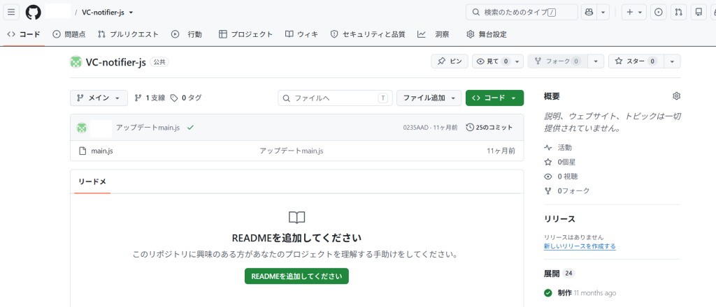
② Is the source code on GitHub?
Items to Check
・GitHub repository
・main branch
・Latest code
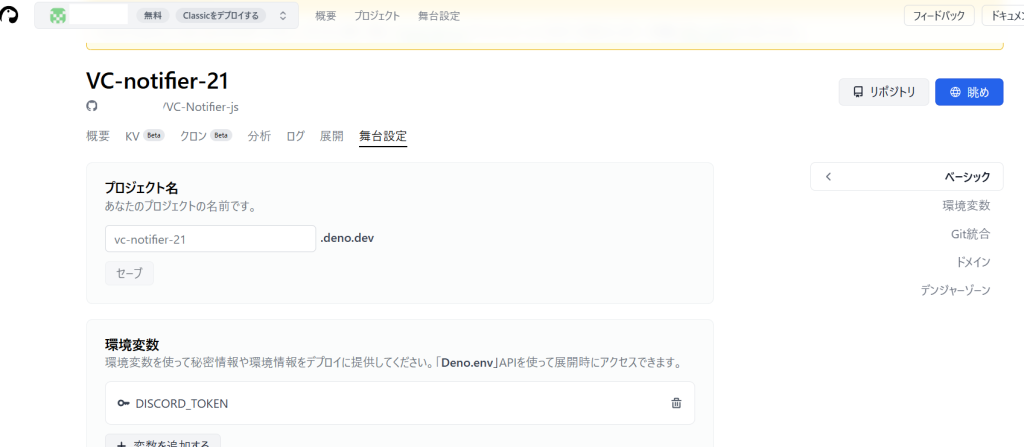
③ Make a note of the environment variables
Open the project you want to migrate in Deno Deploy Classic, and go to “Settings” → “Environment Variables.”
You should see tokens such as DISCORD_TOKEN configured here. Since these tokens are not automatically migrated, if you have a record of them, you’ll need to refer to that during the migration.
If you registered the token during development but didn’t keep a record of it, you’ll need to reissue a new token from the Discord Developer Portal.
The image shows the browser’s Japanese translation, which makes the Japanese look a bit unnatural, but the settings are correct.
Since I had the TOKEN noted down in my production notes this time, I’ll skip the step of reacquiring the TOKEN.
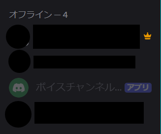
Just a side note… The Discord bot isn’t currently active.
It’s offline.
Actual Migration Procedures
① Log in to the new Deno Deploy
https://console.deno.com/
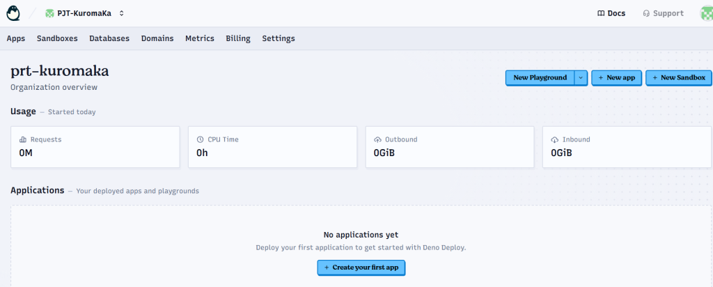
② Creating an Organization
Enter the Organization name and Organization slug, then click “Create Organization.”
If clicking this button reopens the previous Deno Deploy window, open a new Deno Deploy window and check to see if the organization you created is displayed there.
③ Tap “New App”
Tap the “Apps” tab, open “Applications,” and tap “New App.”
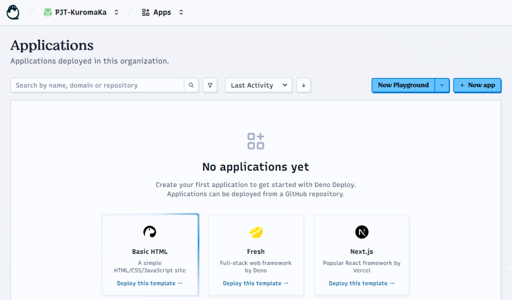
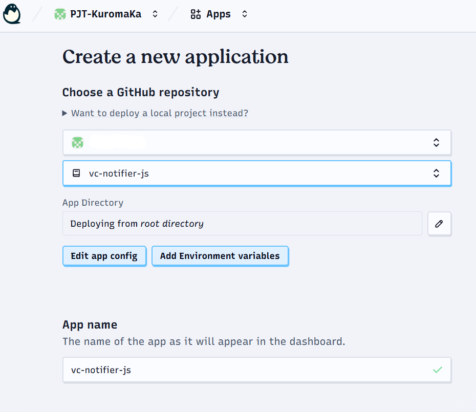
Open “Create a new application,” select your GitHub account, and choose your bot repository.
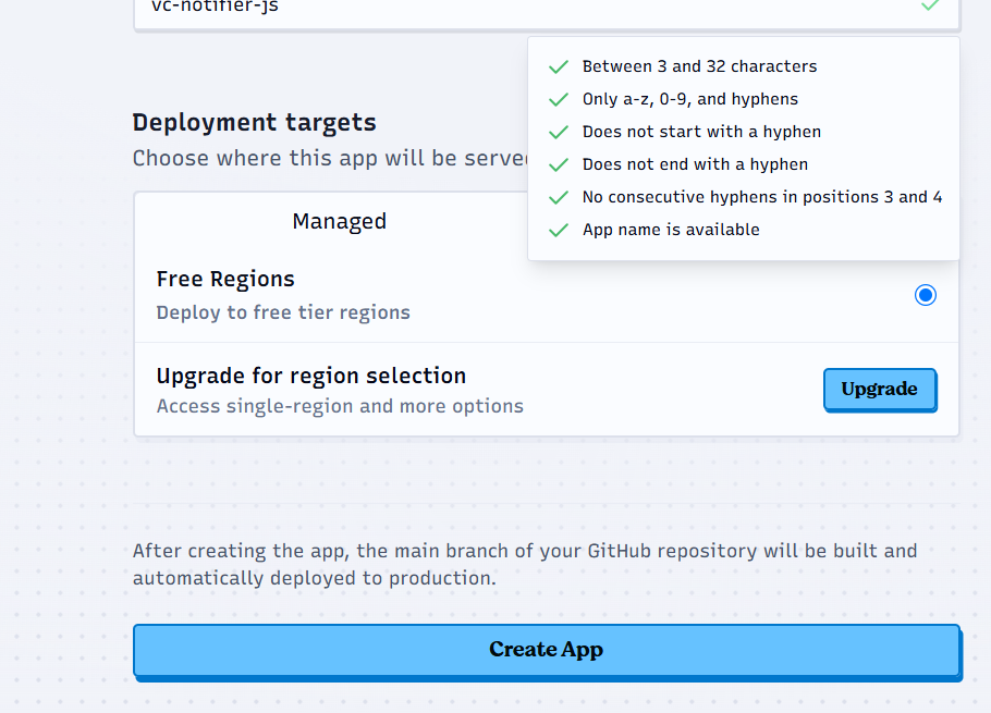
Scroll down and select your deployment targets.
Since this is a free plan, select “Free Regions” under “Managed,” then click “Create App.”
*This guide assumes you have already uploaded your source code to GitHub and have set up a new DenoDeploy integration with GitHub.
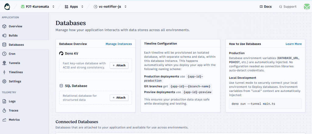
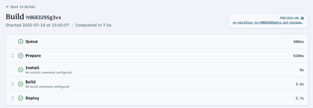
The build will start, but it will fail if you haven’t migrated the KV Database.
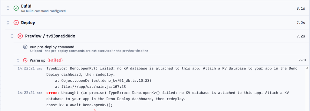
Click “Database” within the project to open the Database screen and migrate the KV Database.
Click “+Attach” for Deno KV on the following page
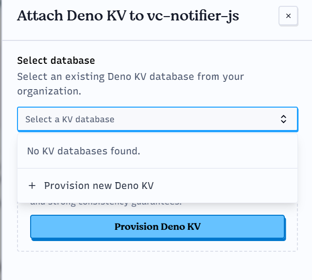
Click “provision new Deno KV” to create a KV database
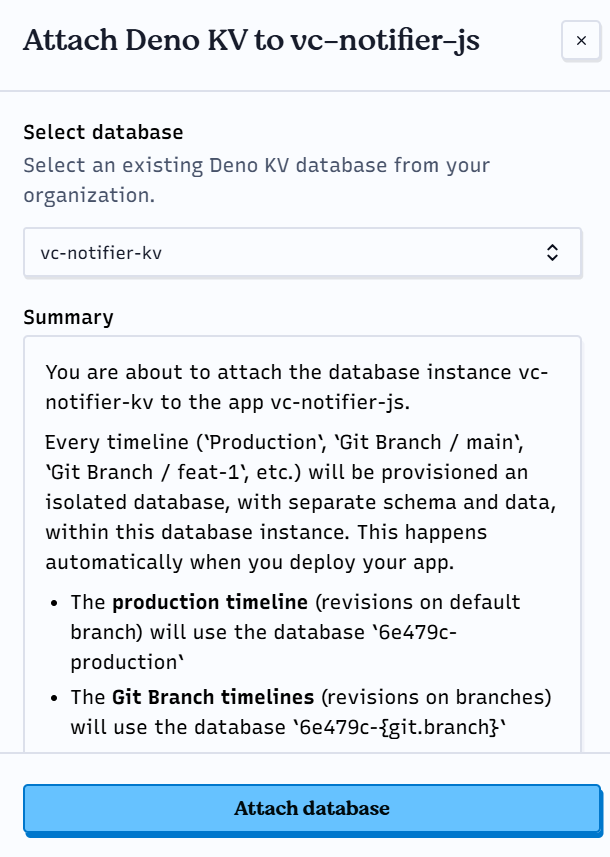
Verify that the database you created is selected, then click “Attach Database.”
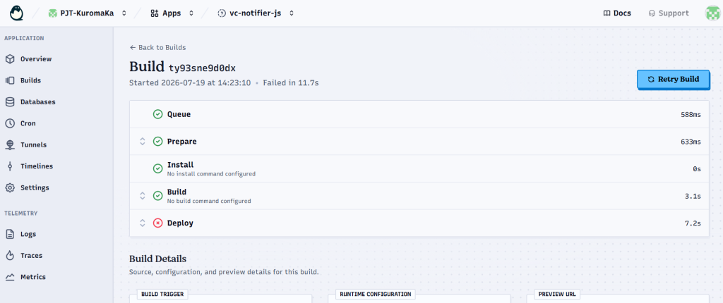
Return to the Build screen and click “Retry Build.”
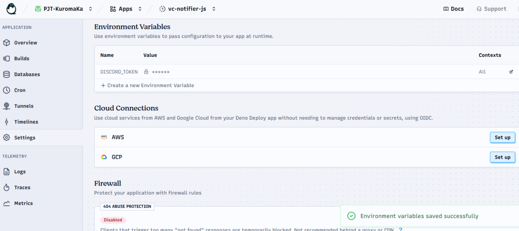
④ Set the environment variables
Set the DISCORD_TOKEN in the “Environment Variables” section of the “Settings” page within your new Deno Deploy organization.
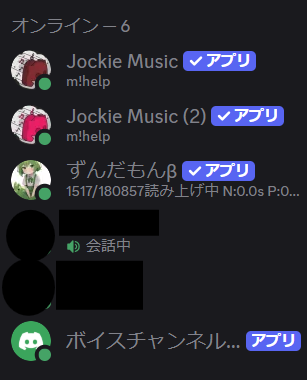
⑤ Check if you’re online on Discord
I am.
Now all that’s left is to test the system, and if it’s still running smoothly the next day, we’re all set.
This has been a long post, but that wraps up this edition of the Engineer’s Blog.
Stay tuned for the next Engineer Blog post.